

HOPE ARCHITECTURE – DESIGN
HOPE — Architectural Identity
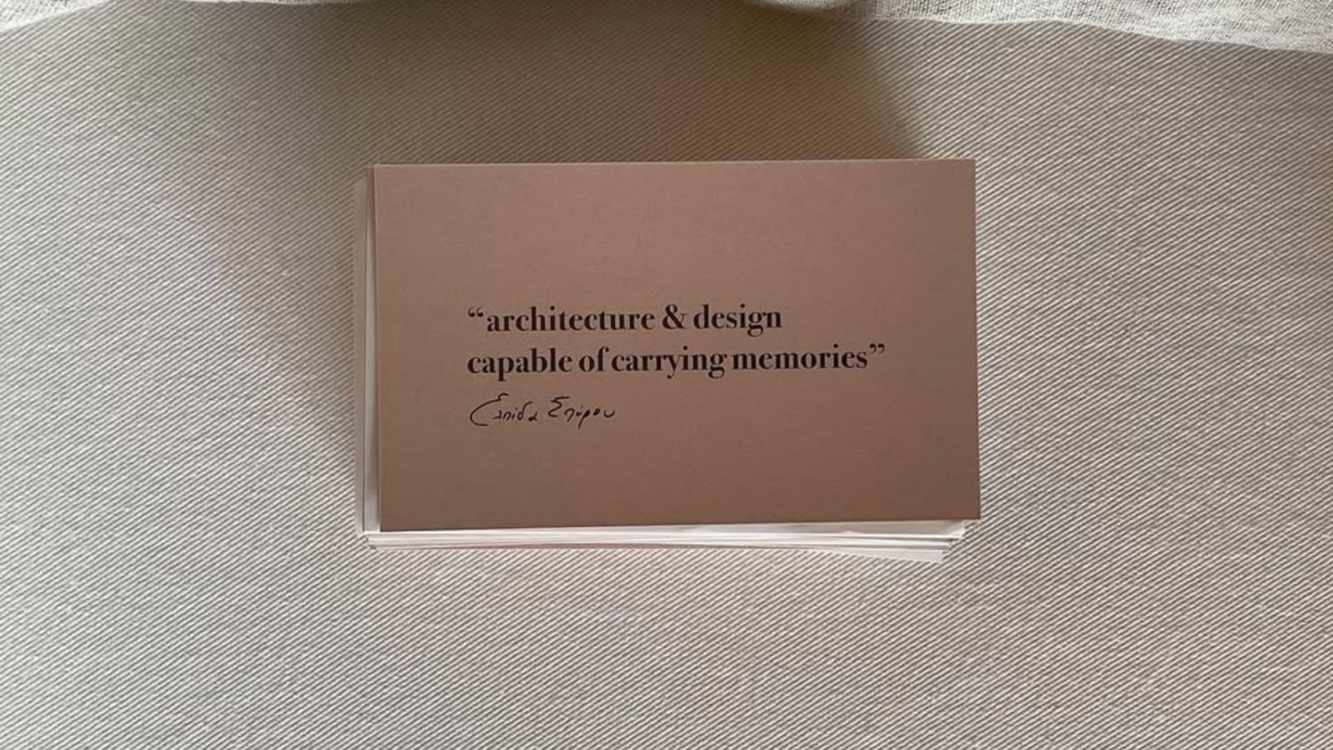
A simple word. A vast meaning.
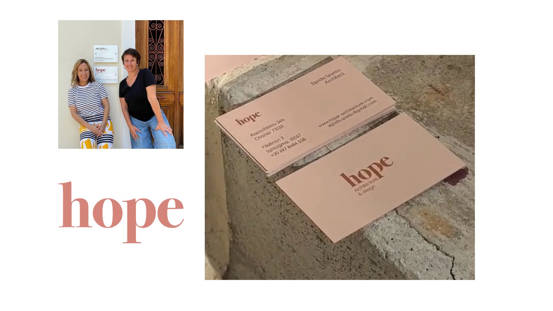
HOPE is the English translation of Elpida, the name behind the architectural practice of @elpidaspyrou_.
An identity inspired by the language of architecture: form, material, texture and the beauty of simplicity.
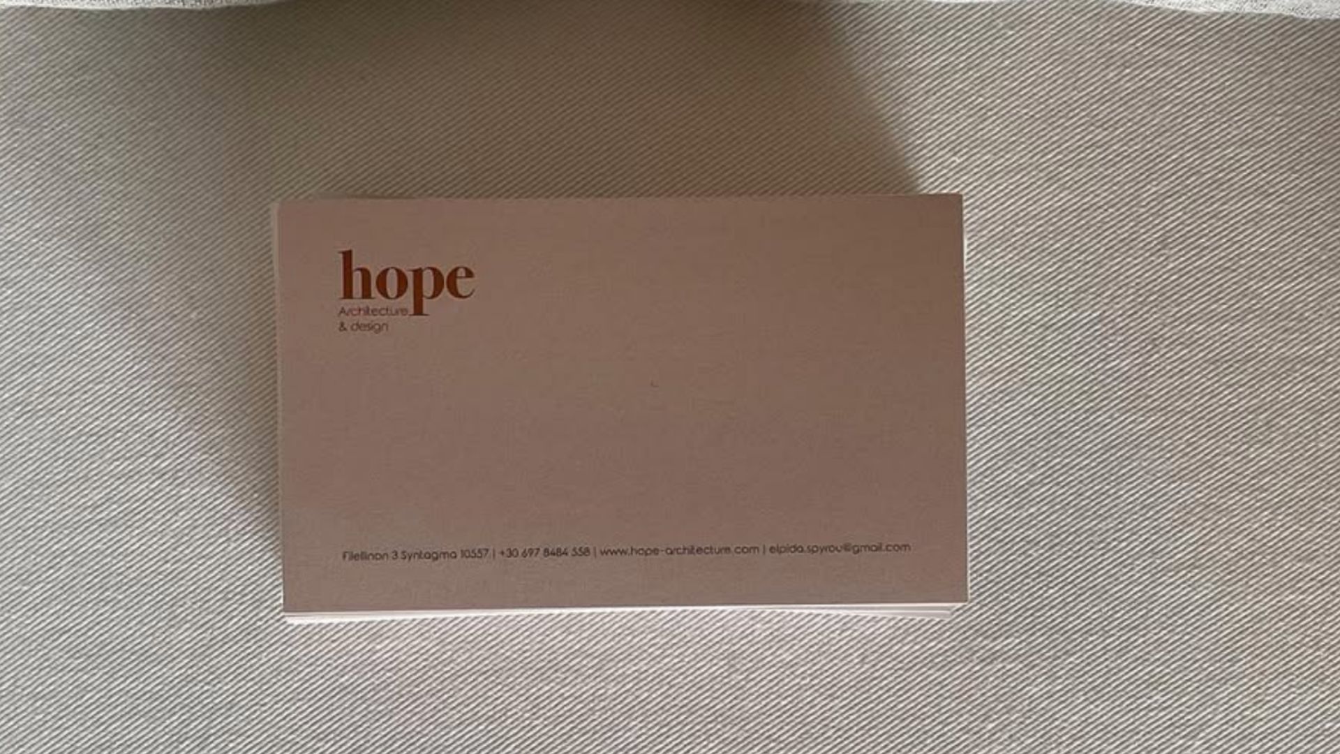
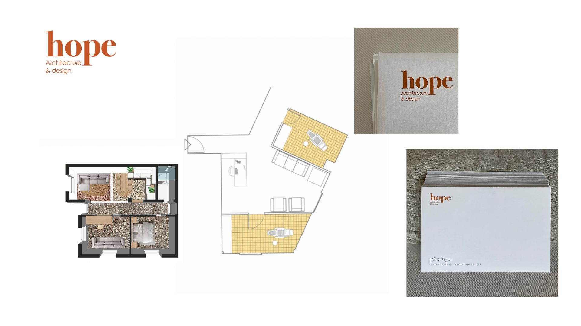
The logo is hand-drawn, with each letter carrying its own subtle character. Organic shapes meet clean, minimal typography, balancing expression with structure.
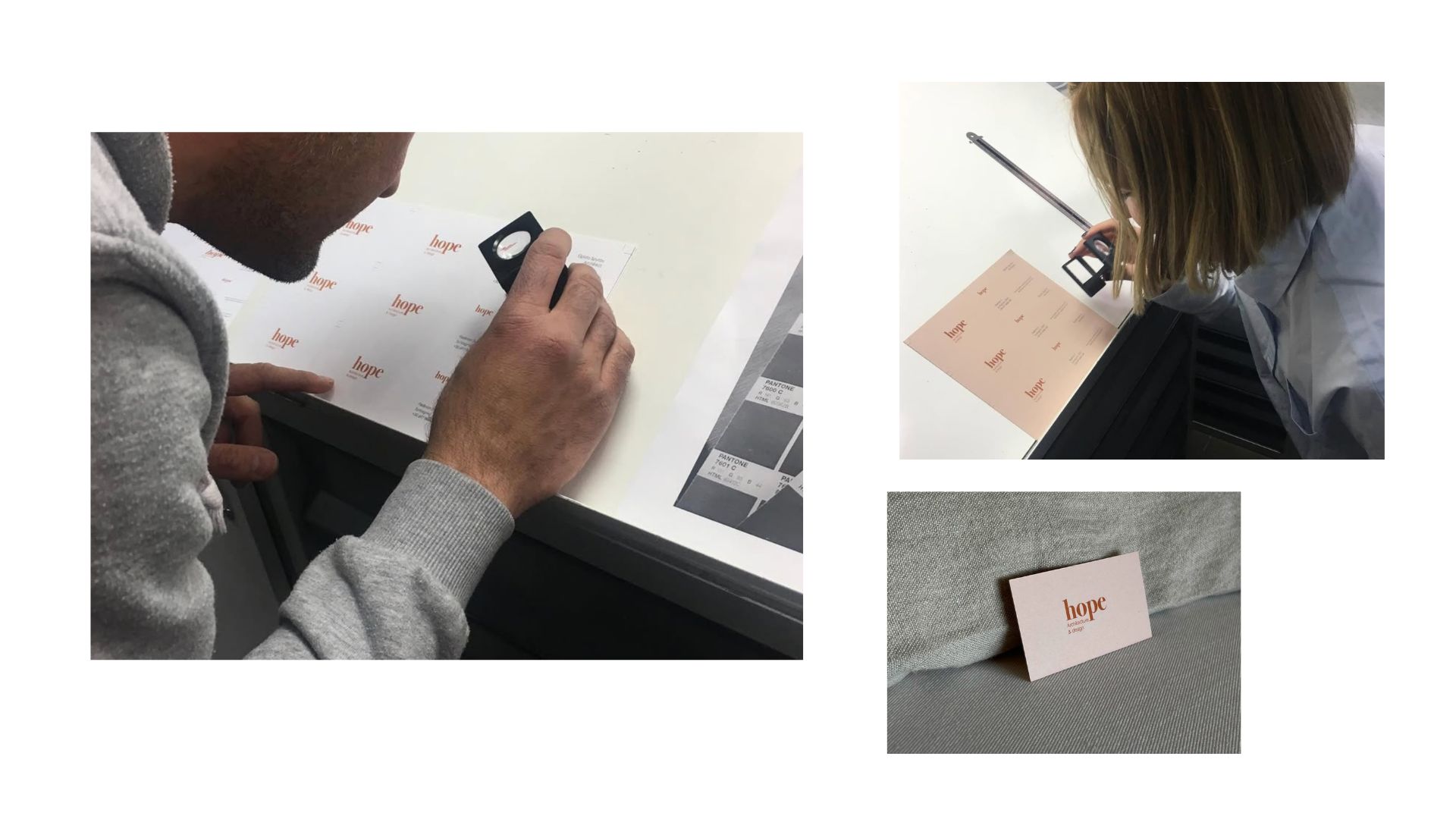
The colour palette draws from two essential architectural materials: terracotta, reflecting the warmth and earthy texture of brick, and grey, echoing the raw honesty of concrete.
Two colours. Two materials. A dialogue between warmth and structure, intuition and precision.
More than a name, HOPE is a way of seeing space with sensitivity, imagination and the belief that beauty begins with a simple idea.
Designed with hope.
Date
November 9, 2026