


SELPE REDESIGN
SELPΕ Logo Redesign
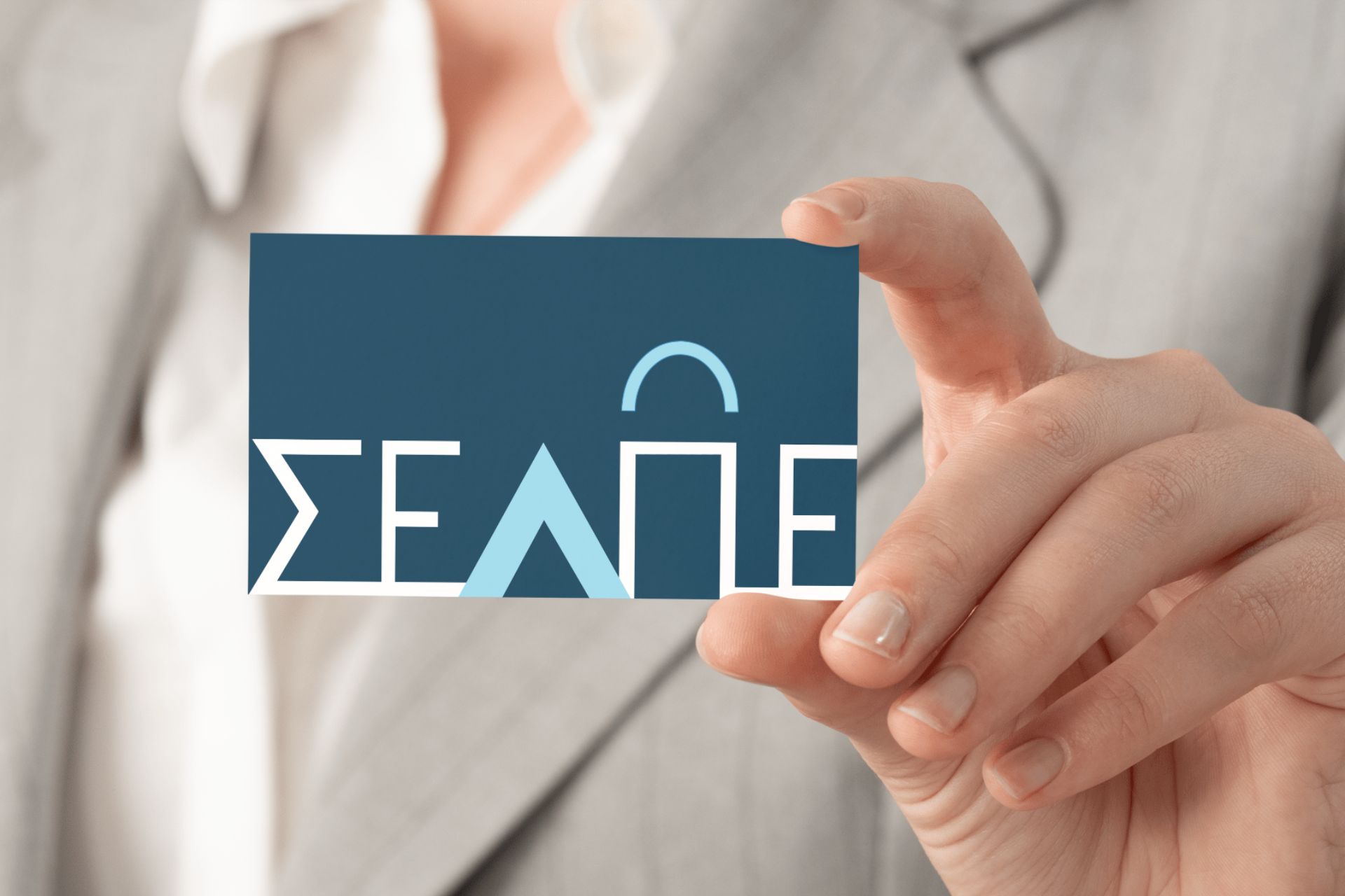
The SELPΕ (Hellenic Retail Business Association) entrusted me with the redesign of its logo following the election of a new President. The goal was to create a fresh, modern, and clear identity while maintaining the original initials, strengthening the connection to the retail sector, and highlighting its Greek identity.
Typography played a central role in the redesign, ensuring the logo is dynamic, instantly recognizable, and directly linked to the retail industry.
Typographic Approach
For the logo design, the primary choice was PFFutura, a geometric sans-serif typeface known for its clarity, modern aesthetic, and timeless character.
PFFutura is based on Bauhaus principles and is characterized by:
Geometric shapes, conveying stability and reliability.
A clean design, enhancing readability and simplicity.
A contemporary yet timeless feel, linking SELPΕ to the future of Greek retail.
Design Approach
The shopping bag symbol: The letter “π” is shaped to resemble a shopping bag—an enduring symbol of retail. The bag serves as a visual reference to commercial activity while also functioning as a mobile advertisement with strong impact.
The letter “λ” as a peak symbol: Positioned at the highest point of the design, the letter “λ” represents a peak—symbolizing success and reinforcing SELPΕ’s role as a leading force in Greek retail.
Color Palette
The color palette was carefully designed to reflect SELPΕ’s Greek identity. Shades of blue were chosen, evoking Greek heritage as well as trust, stability, and reliability.
Additionally, a secondary palette with various shades of blue was created, allowing for flexible logo applications across digital and print media while maintaining visual consistency in SELPΕ’s branding.
The new logo embodies SELPΕ’s modern, dynamic, and leading role, seamlessly connecting the organization with the present and future of Greek retail.
Date
March 5, 2025