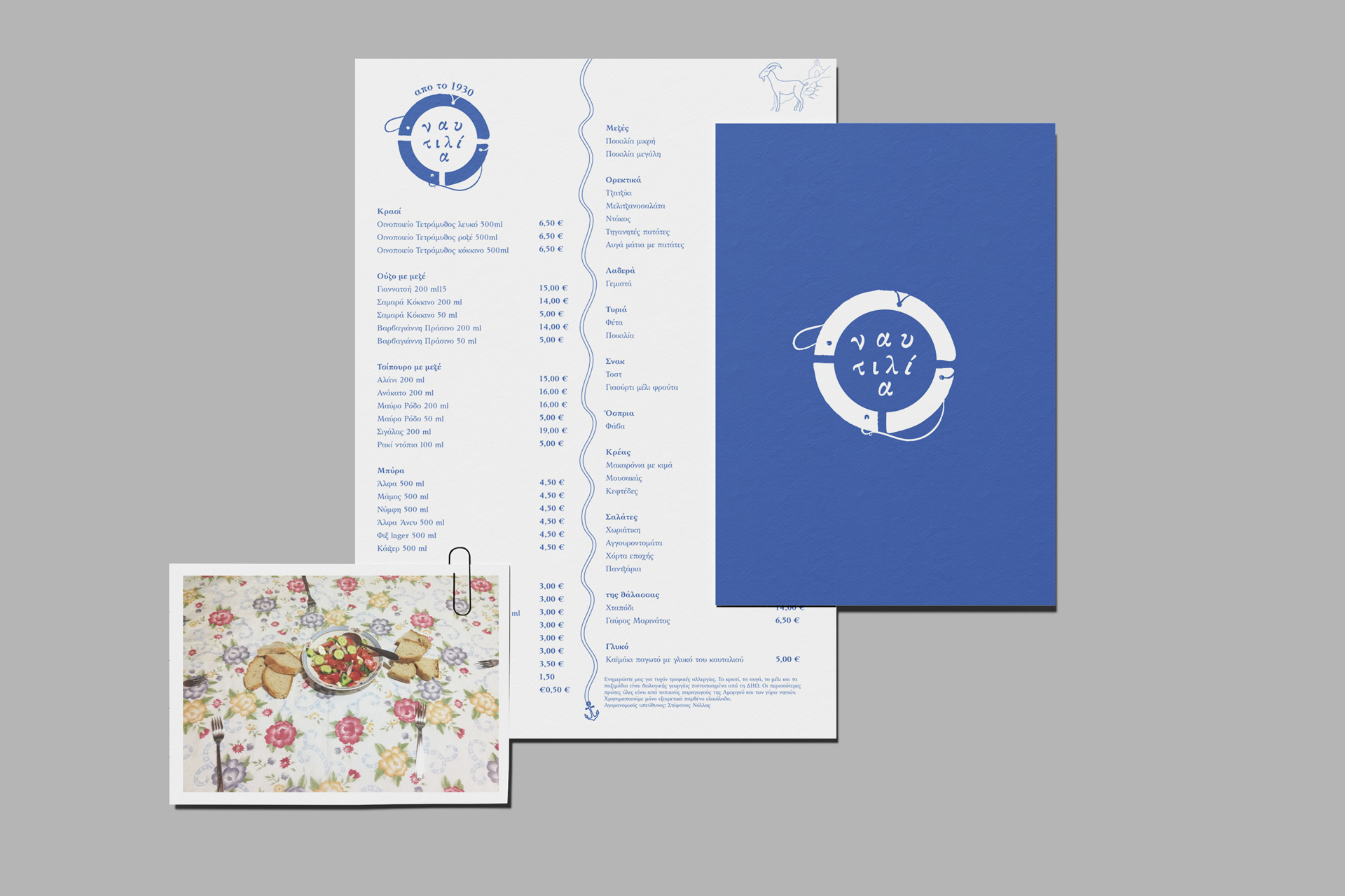
ναυτιλία Αμοργός
Visual identity / logo description
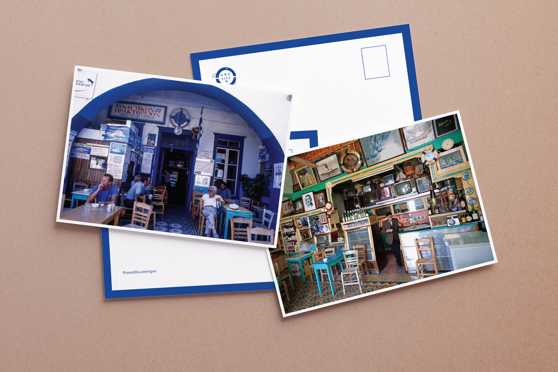
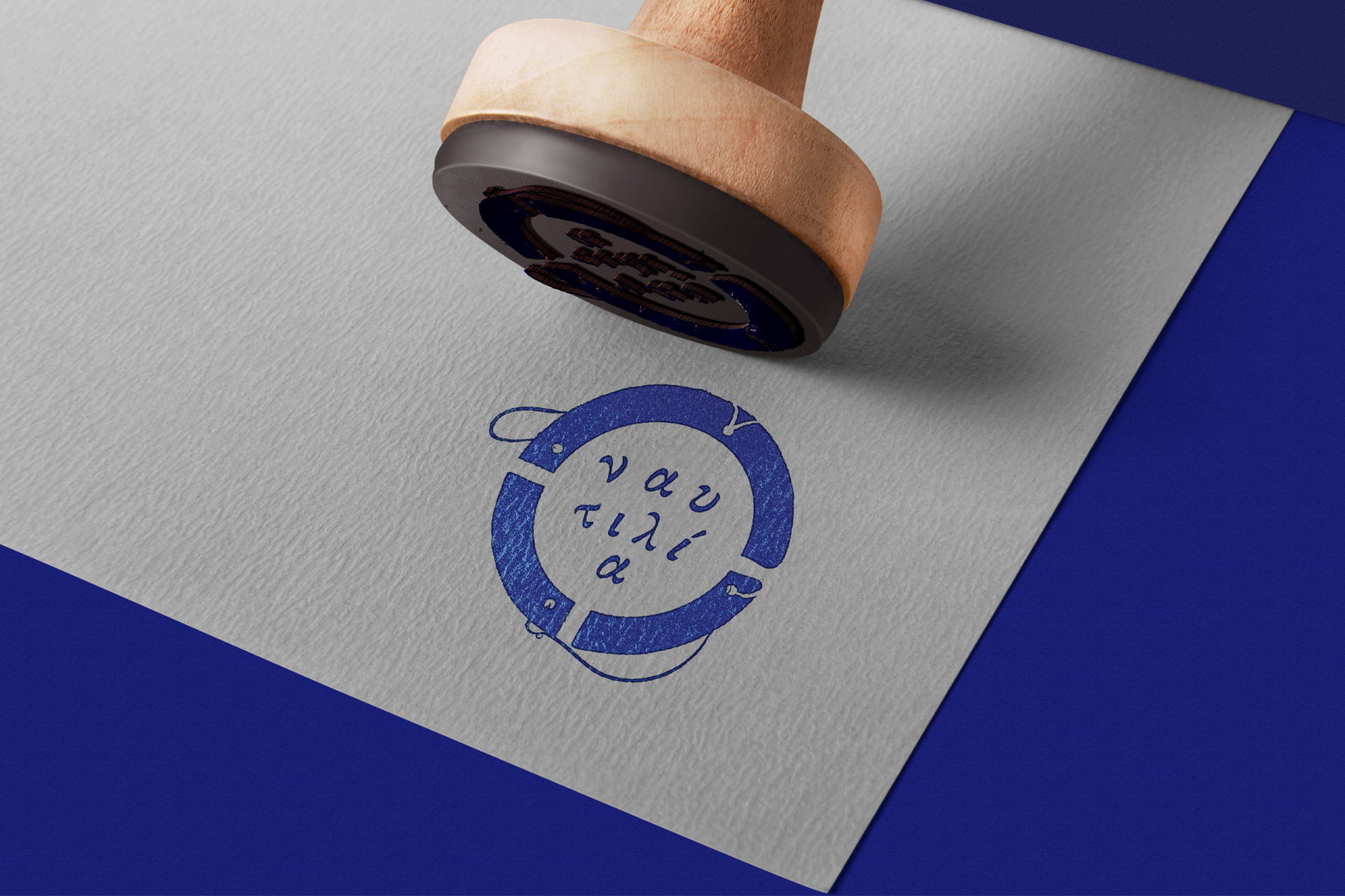
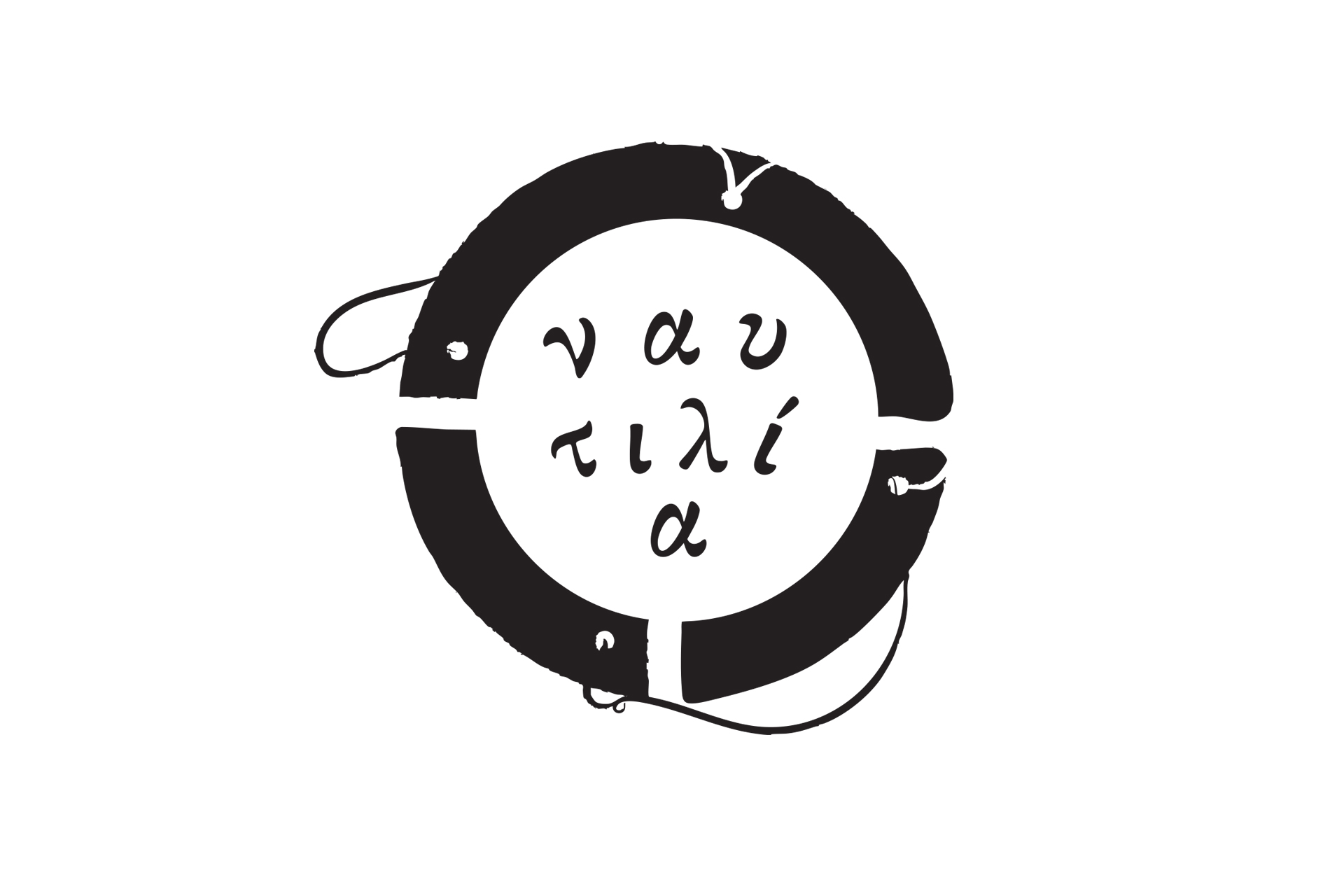
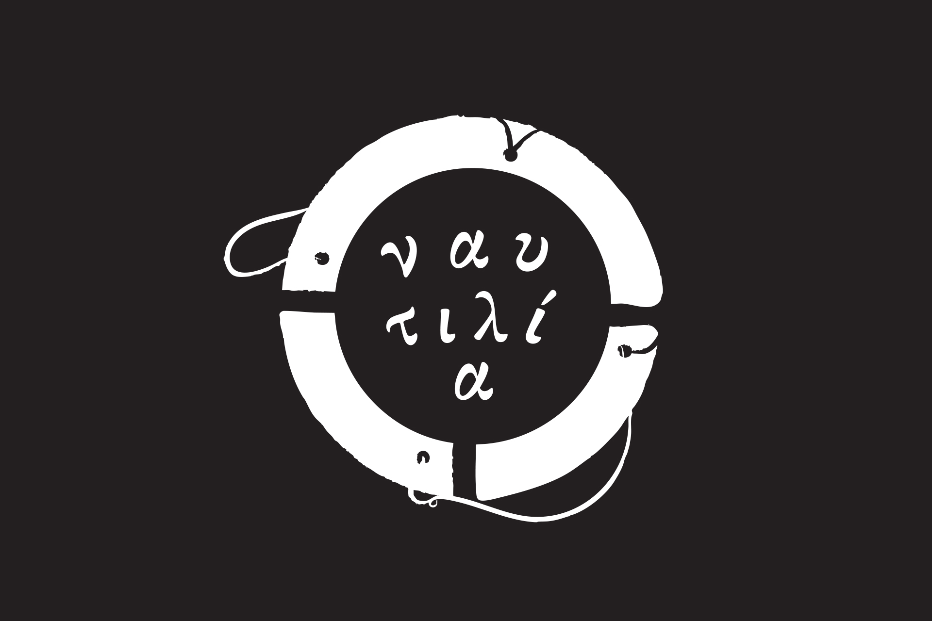
The logo was created for the reopening of a historic café–tavern in Amorgos, with the primary aim of preserving the memory and character of the place without altering its history. Inside the café, an old painted lifebuoy bearing the name “Prekas” and the title “Nautilia” had long been present. This element became the conceptual starting point of the design and was transformed into the central symbol of the new identity.
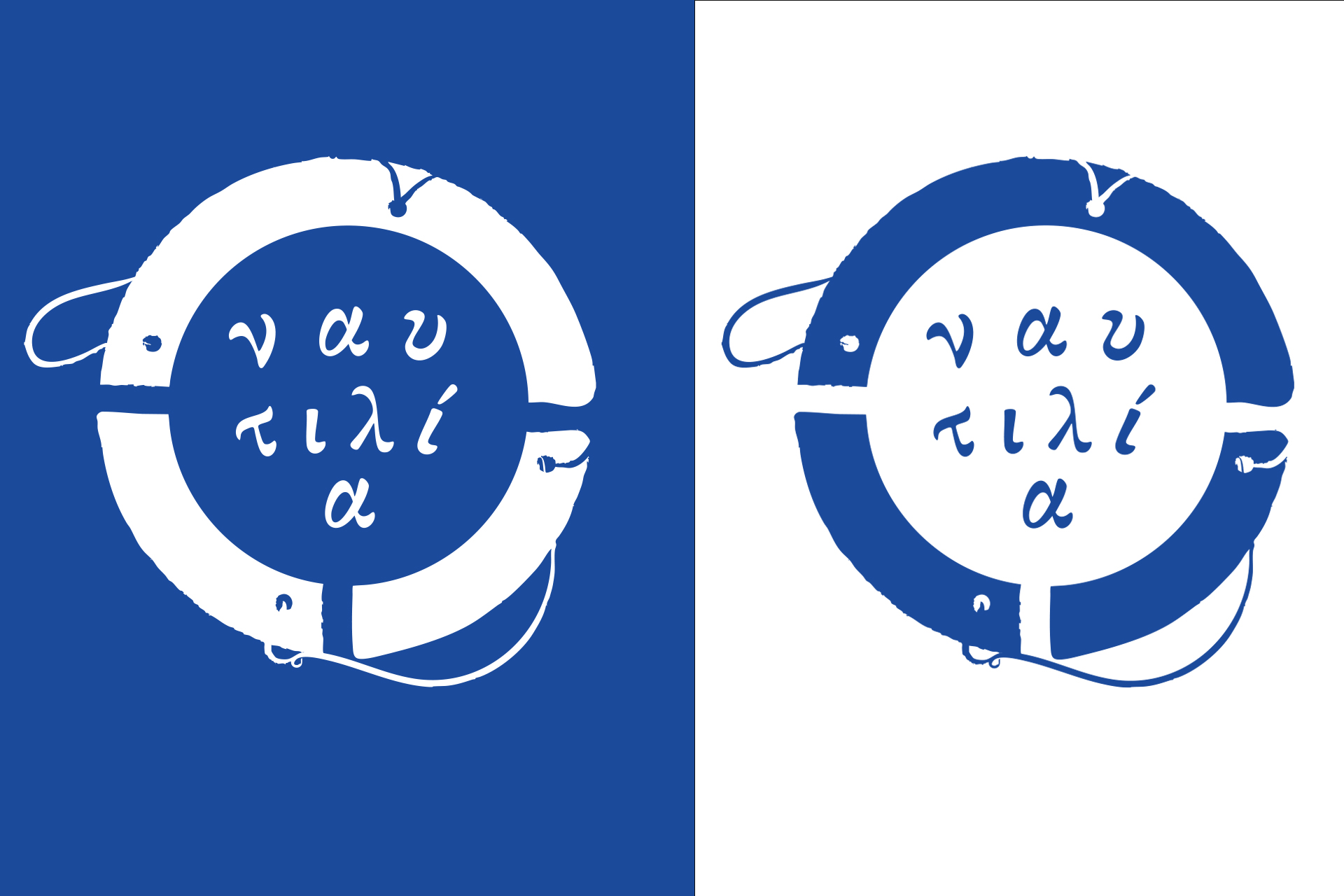
The logo is based on the circular form of the lifebuoy, within which the word “Nautilia” appears arranged loosely, as if floating at sea and being rescued by it. The composition refers both to the maritime identity of the location and to the role of the space as a point of gathering, hospitality, and—through its publishing activity—the preservation and circulation of ideas.
The chosen typeface, designed by Katsoulidis, references Greek typographic tradition and reinforces the authentic, timeless character of the identity.
In developing the mark, the intention was to preserve the lifebuoy not as a sterile symbol but as an object shaped by history and use. For this reason, the logo was not rendered in a fully polished or stylized manner. Instead, subtle imperfections, rough edges, and ink-like textures were deliberately introduced, recalling printing flaws and residues commonly found in engraved or relief print works.
These intentional irregularities act as visual traces of age and memory, strengthening the café’s sense of authenticity while avoiding a contemporary aesthetic detached from its past. The logo thus balances the new with the old, functioning as a continuation of the place’s history rather than its replacement.
Date
February 10, 2026